
Print/Collateral

Honda S2000 Sales Brochure
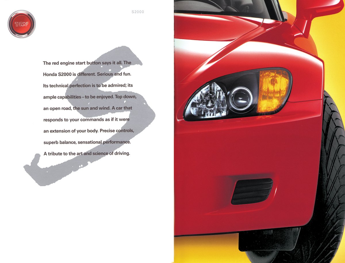
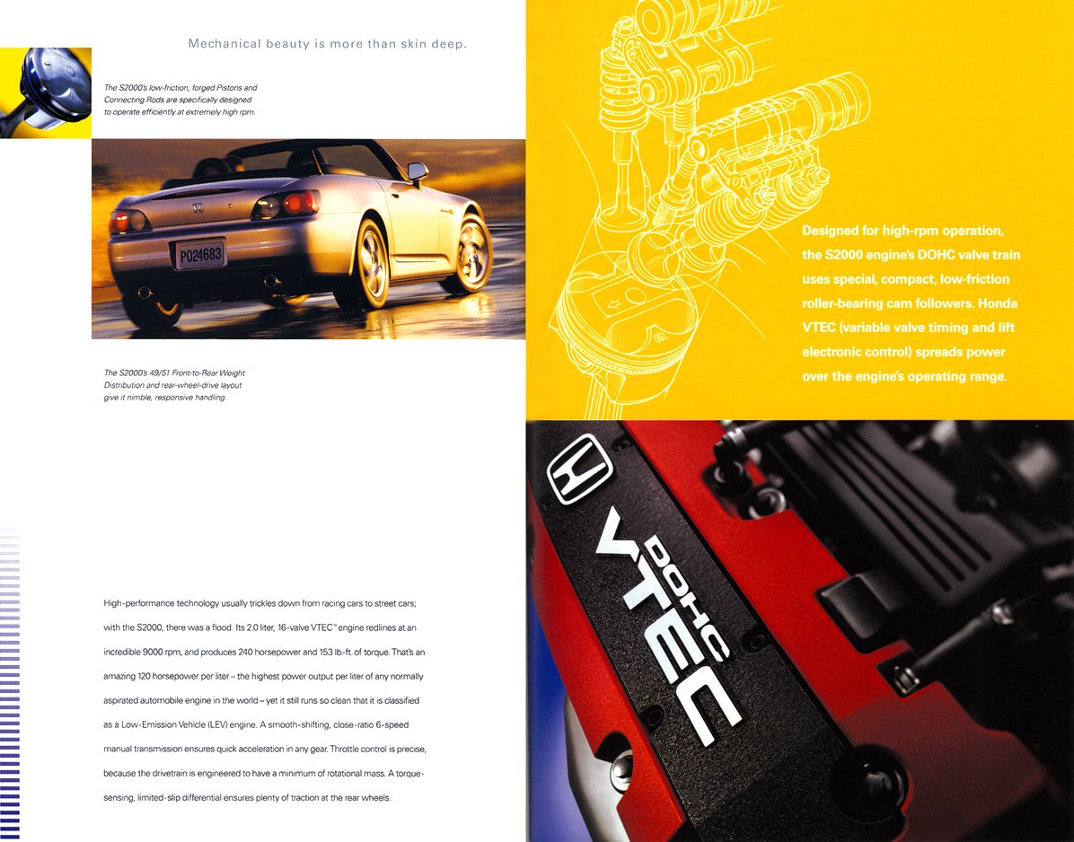
Launch brochure for Honda’s new roadster. It was a departure from Honda’s normal lineup and a bit out of character at the time. Honda takes pride in their engineering prowess, and the S2000 was a showcase. The vehicle featured 50/50 weight distribution, which drove part of the visual concept. Layouts were divided in half, and images of the car were cropped in half for dramatic effect. Also, the paradox of a conservative car company making such an outrageous vehicle informed a play of simple vs. complex, white space vs. color, and emotional photography paired with schematics drawings.
Design and photo art direction: Tye Bergeson; Photography: Rick Rusing



Acura Sales Brochure
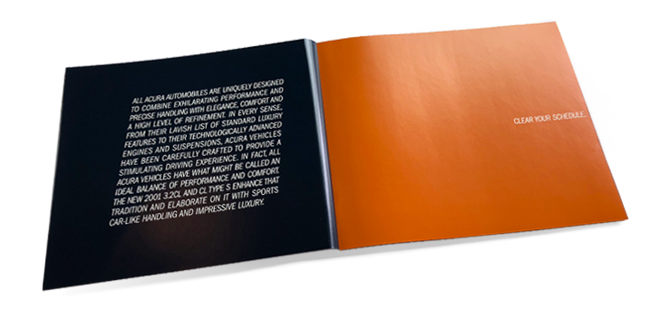
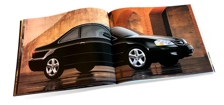
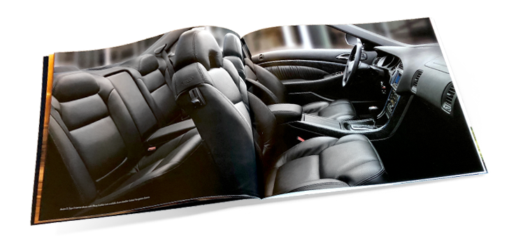
This brochure represented a change in position for the Acura brand. For a decade, the brand used stereotypical images of luxury (stone, classic typefaces, equestrian clubs, ivy, etc). With the launch of the CL, they began to explore returning to their roots as a performance automobile company. This brochure established many new norms for the years that followed, including contemporary photography with selective focus, more contemporary typography, and the use of vivid colors.
Design and photo art direction: Tye Bergeson, Janine Rubinfier




Honda Sales Kit
An opportunity to showcase a full set of new model year sales brochures in a hard case. Also included is a color and trim guide for each vehicle in the Honda lineup. Bright colors and glossy finishes reflected the sense of energy in the Honda lineup at the time of printing.
Design: Tye Bergeson


Offroad motorcycle enthusiast magazine.
Creative direction and design: Paula Neff; Design and production: Tye Bergeson


Annual Benefits Enrollment Guide
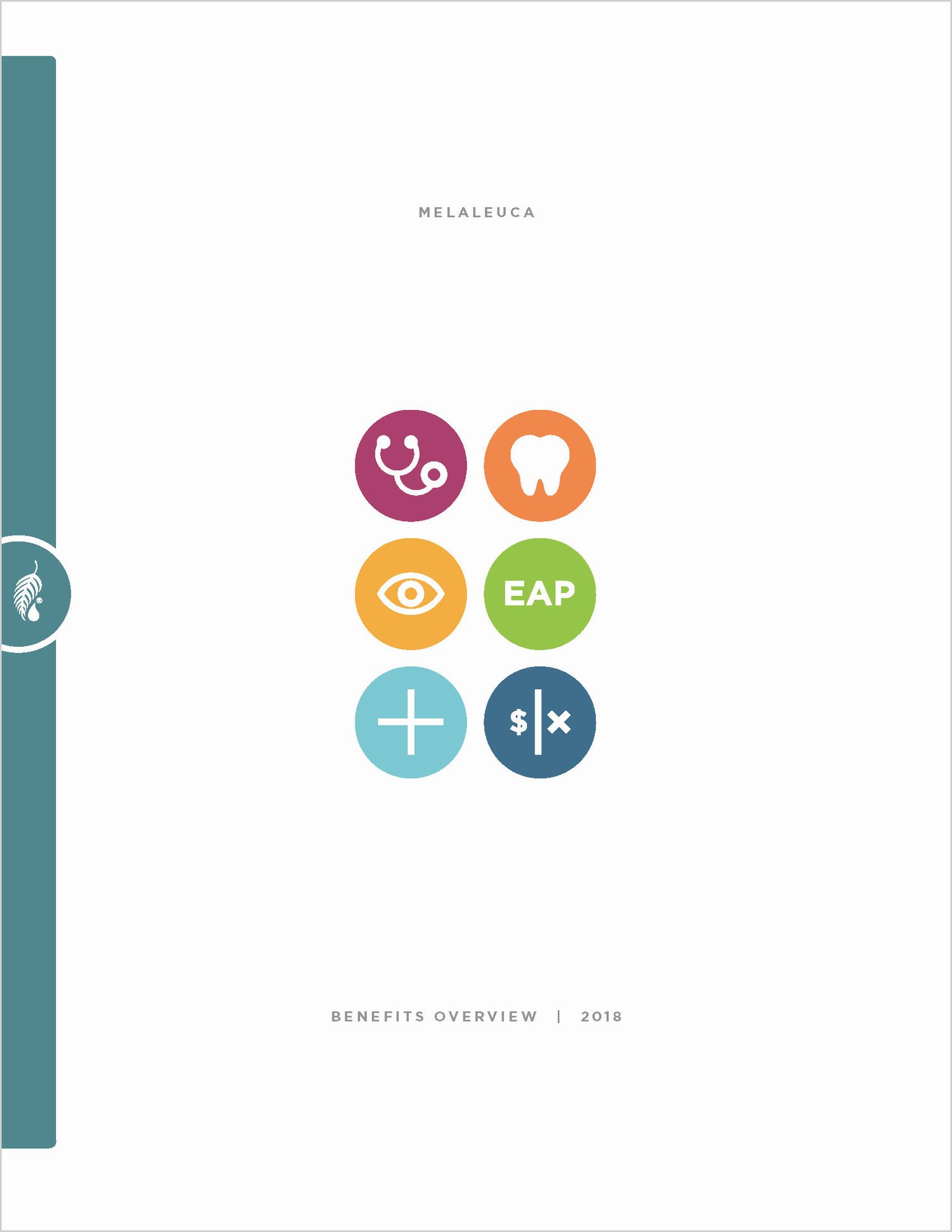
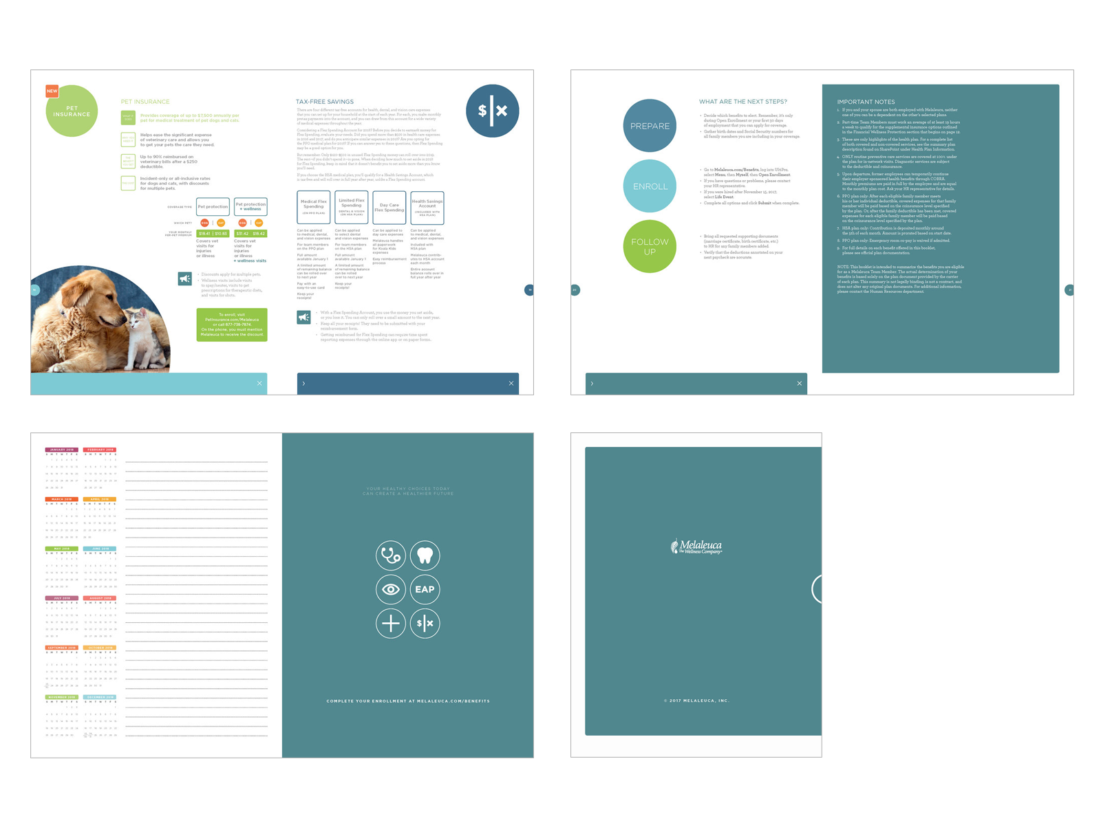
The HR Benefits team has an annual task of making sure that copious amounts of healthcare information is communicated as thoroughly as possible, while still being user-friendly. We identified every level of information and created as close to a UI experience as possible in a print format. In doing so, we utilized vivid colors and engaging shapes that helped further communicate the layers of information. The resulting piece was well received internally and praised by the insurer.
Creative direction: Tye Bergeson



Article design for monthly sales training magazine
Customers are often unfamiliar with the entire lineup of products available to them. This article was primarily aimed at sales staff to inspire them to help new and existing customers explore the product line. The concept came from the idea that customers often stick with a small handful of known products (looking at a few constellations through a telescope), when in fact, there is an entire galaxy worth of stars to explore.
Creative direction: Tye Bergeson


Ad for monthly sales training magazine
Creative direction: Tye Bergeson


Weight loss promotion in sales training magazine
Design and creative direction: Tye Bergeson
