


Nearly every project I’ve worked on in my career, I have approached from the point of view of, ‘How do I grow this brand?’ Before I begin design work, I seek to understand what came before, what comes after, and how the current assignment will effect what’s going on now—with existing products, designs, or the competitive landscape. I love bringing intention to my work so that others may build upon it when it’s no longer on my plate. I could easily move many of the projects from other portions of my site to this section and discuss the impact of the work on the particular brand it was for. The projects here are some of the most recent, most fundamental in the brand building process, but I love all aspects, from customer touch-points, packaging, signage, building and environmental design. Everything makes a statement. I can help your brand make the right one.
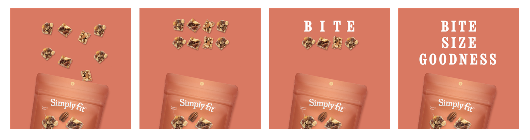
A new series of products were introduced into an existing brand lineup. The new product packaging needed to simultaneously feel fresh and new, while maintaining some family resemblance to existing products. The Nut & Fruit Clusters and Protein Bar packages were designed with a flexible framework in mind that then allowed web, social, and print teams to easily extrapolate elements for their purposes, creating a rich visual vocabulary with which to promote the products.
Sales and recruitment materials for a direct sales company were ready for an update. Historically, the company had a few ‘sticking points’ with customers that had never been directly addressed. The tactic had always been to tout the benefits of the products over the brand experience. This design concept, co-developed with Ranzenhaus Design, took a handful of those sticking points and addressed them head-on, turned them into positives by explaining the business model in a way that amplified the benefit to the customer. We developed a curated brand-centric experience for the customer along every touch-point, from sales presentation to post-enrollment validation to first product order. The ideas of a ‘sustainable cycle’ in the customer/company relationship and ‘products you love’ became the thematic concepts driving design decisions. This concept series and its updated visual language ended up influencing all company sales materials for years.
As a result of several separate acquisitions, the client wished to consolidate those purchases under one product and service brand. The audience is caregivers of the elderly, and by association, the elderly themselves. The mark needed to convey trust in the service, and simplicity of function of the devices sold under this brand. The technological nature of this brand allowed for slightly more expressive secondary colors, and intentional spacing considerations alludes to a premium type of service that sets this company apart from other remote patient monitoring services. I also assisted the client in developing the company mission statement.
Design and copy: Tye Bergeson
Project Objective: Provide international teams with guidance on how to adapt product labels to their markets, while still respecting the graphic elements and brand IP that would help the final versions of their labels feel like they were part of the same family as the US originals.
Creative direction and copy: Tye Bergeson
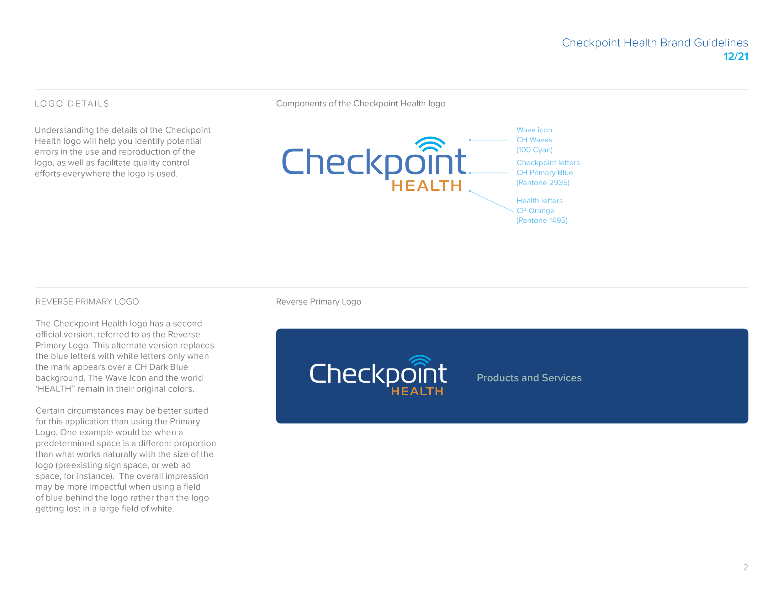
Project Objective: Develop new, comprehensive guidelines for updated corporate logo that would provide guidance to the various business units and international marketing teams throughout the company.
Design and copy: Tye Bergeson
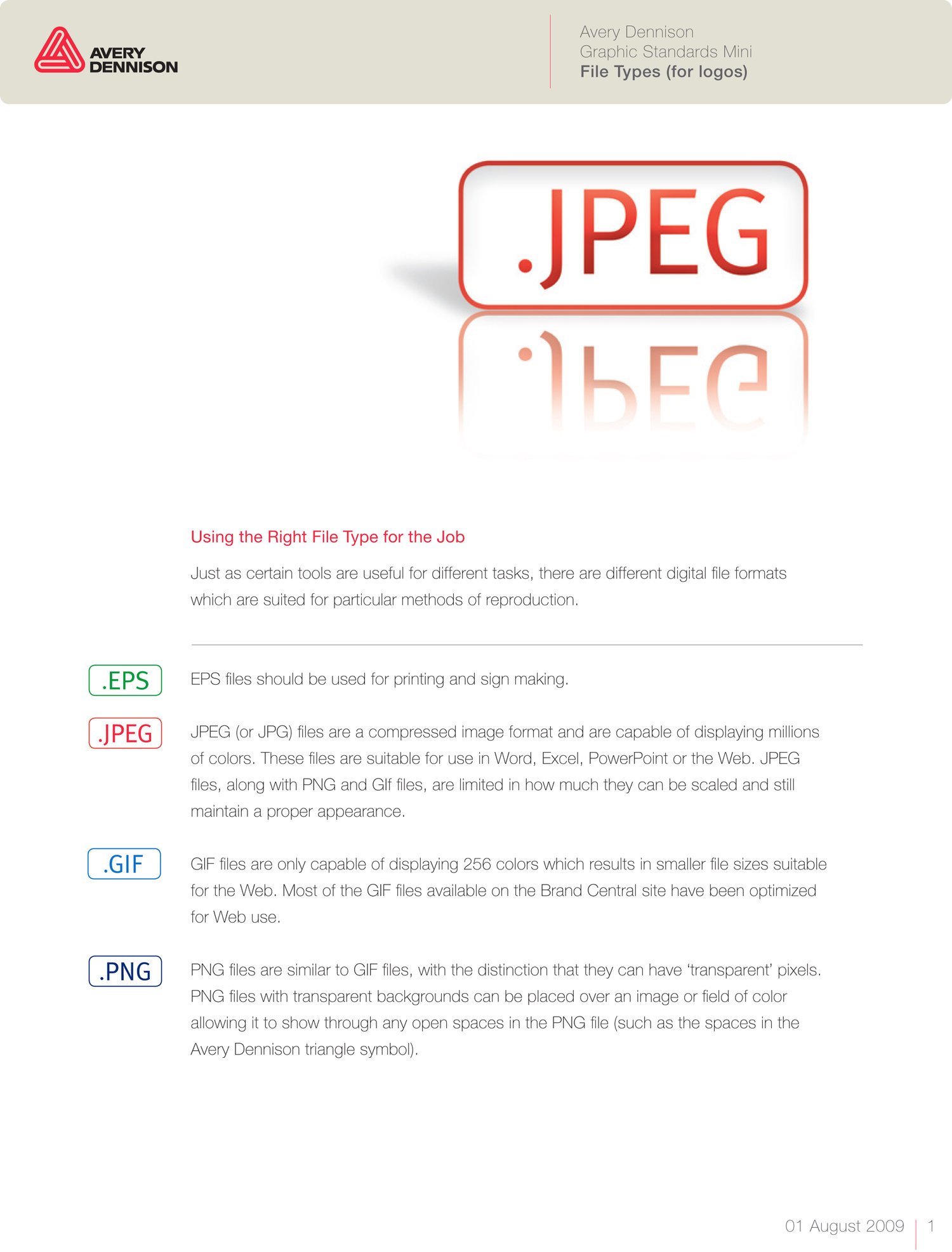
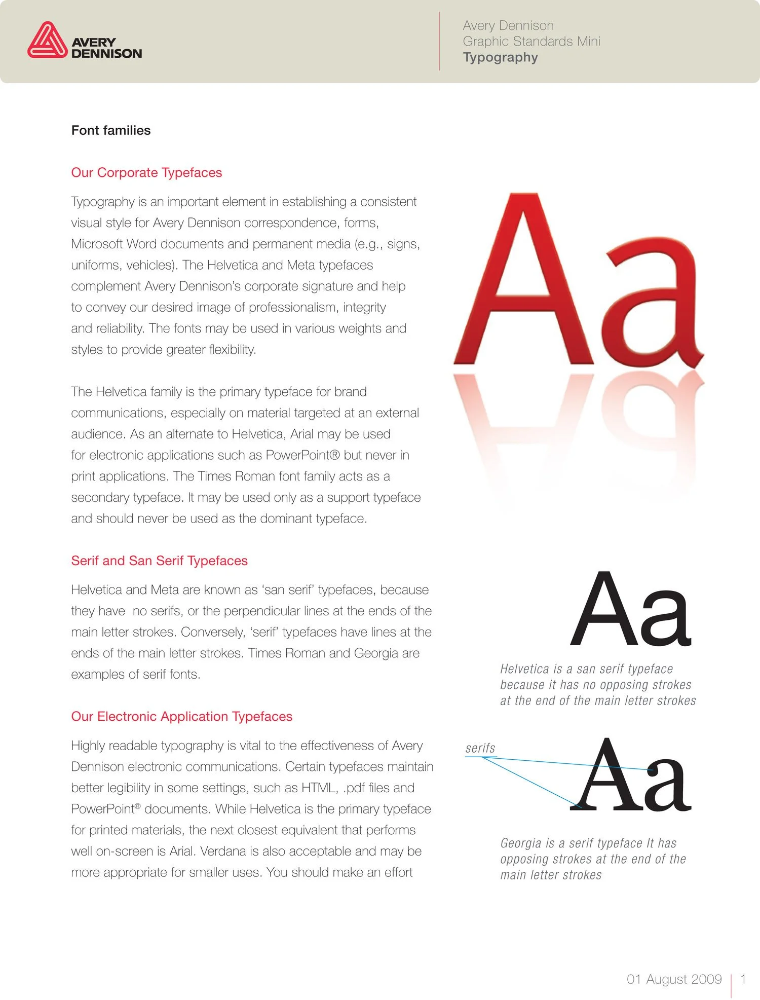
Project Objective: Update a resource formerly found in a 3” 3-ring binder in a way that would facilitate adoption, and ultimately usage and compliance. First steps were to take key sections from the original graphic standards manual and create easily digestible and distributable PDFs, covering such basic topics as corporate type families, color palettes, and adding current info such as file types and photography tips. The second undertaking was to create a digital asset manager from scratch, allowing all of the domestic and international business units to have easy access to the most current brand assets. This project was undertaken long before dedicated DAM providers came on the scene.
Creative direction, design, and copy: Tye Bergeson; Design: Bryan Ranzenberger
A common phrase heard around the offices of Avery Dennison was, ‘We’re the brand behind the brands.’ Avery Dennison’s many divisions make the film, adhesive materials, and label stocks that many well known brands use to enhance their own brand image. These images represented a first-ever undertaking for Avery Dennison to showcase the quality of their products as they existed on their customers’ products. Previous company marketing images were often just product images provided by their customers.
Photo art direction: Tye Bergeson
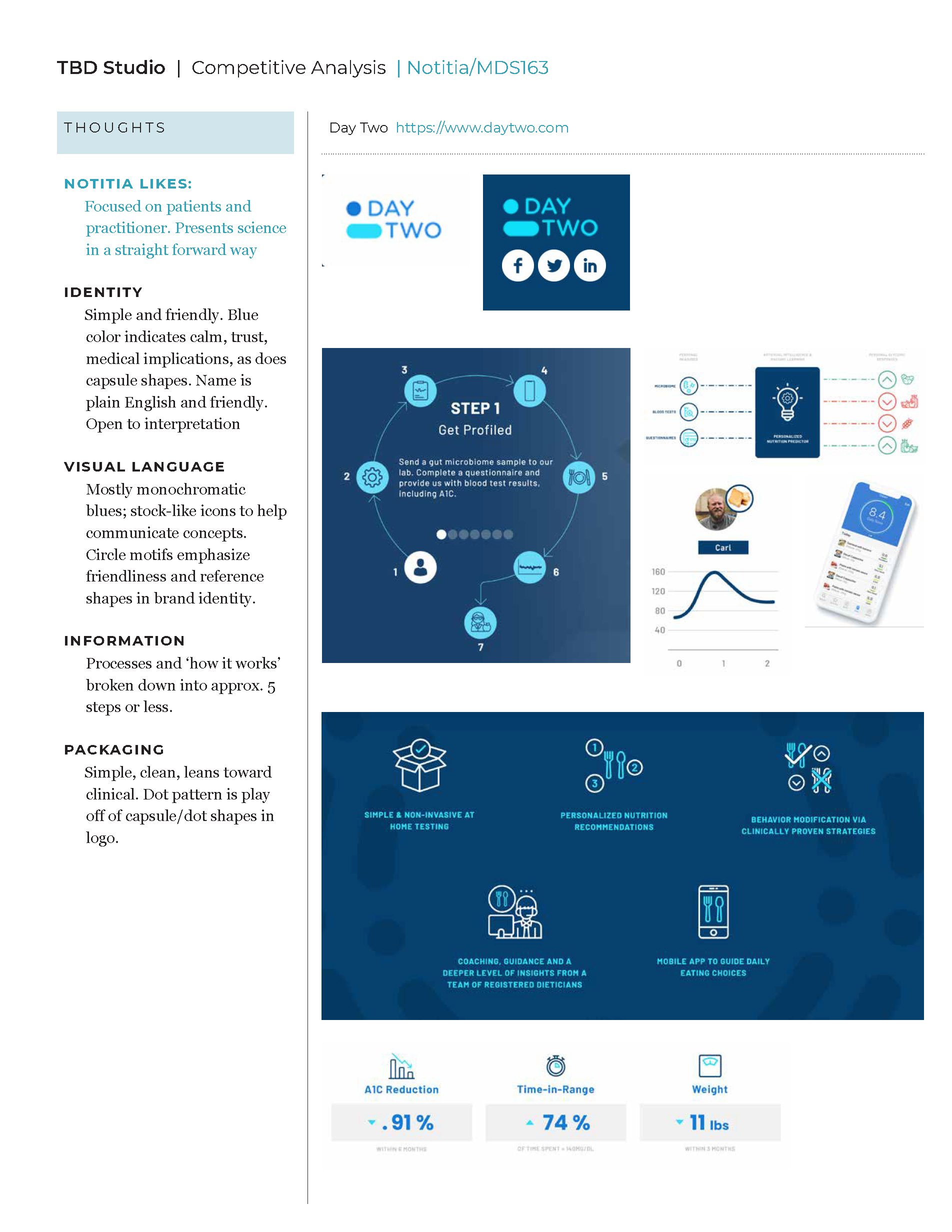
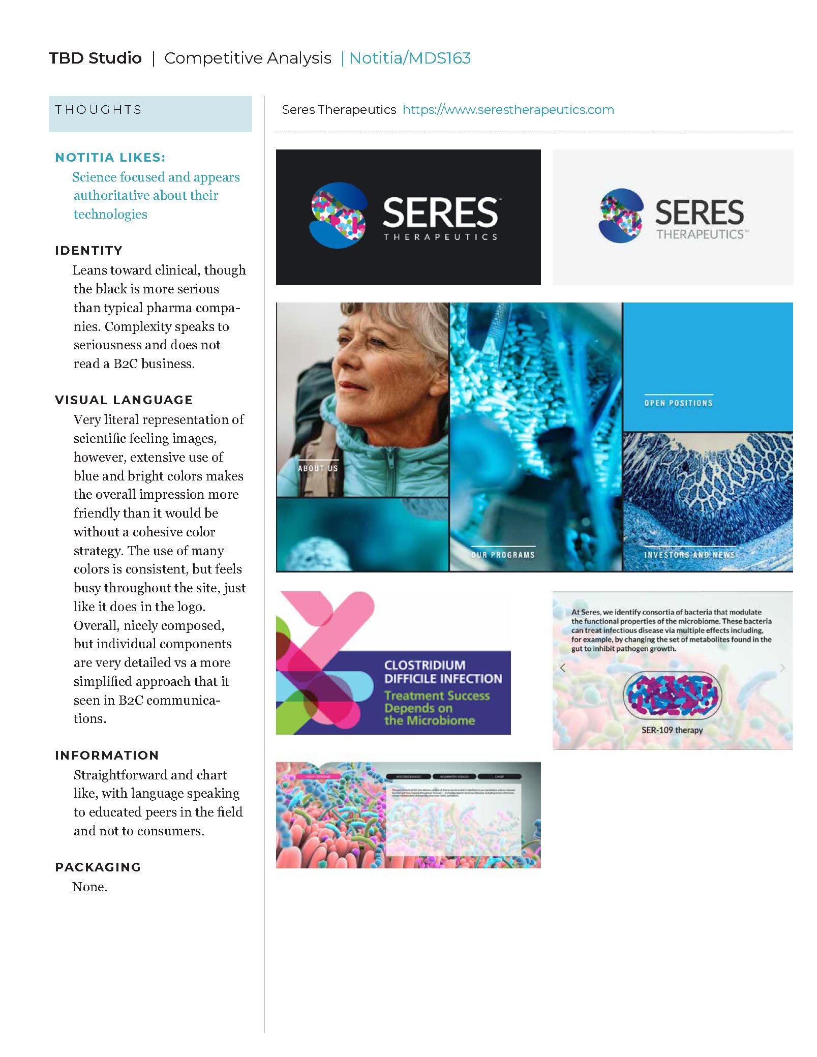
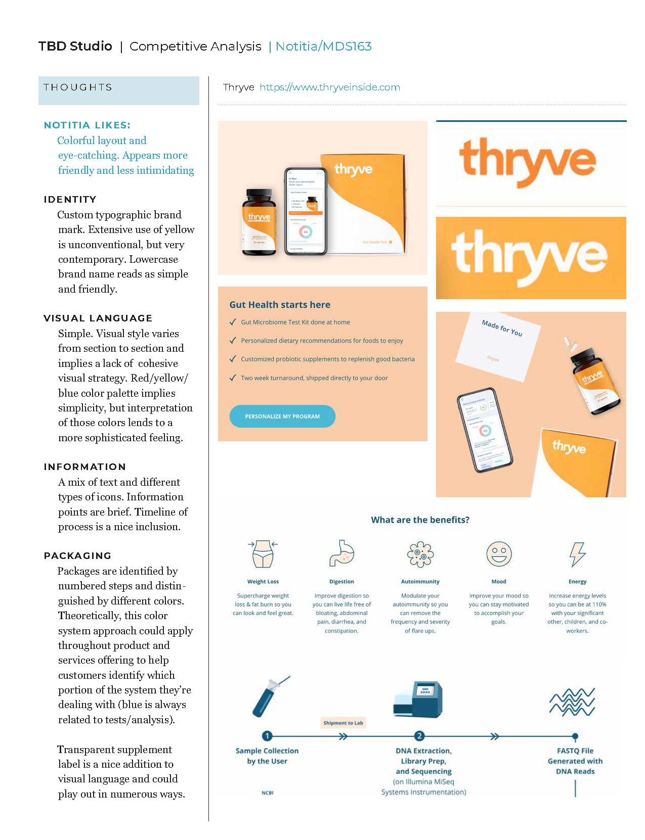
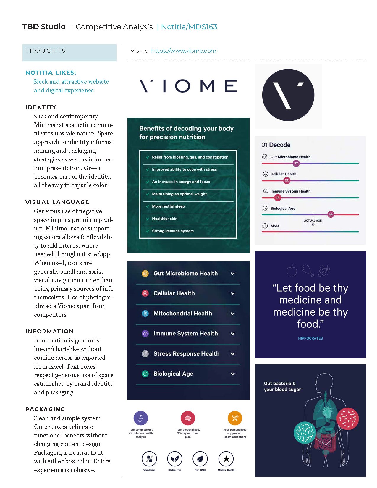
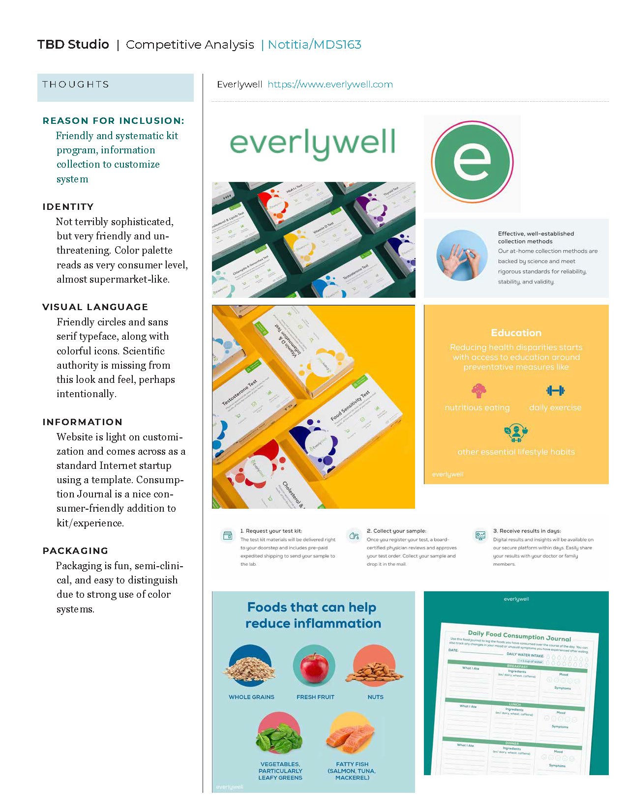
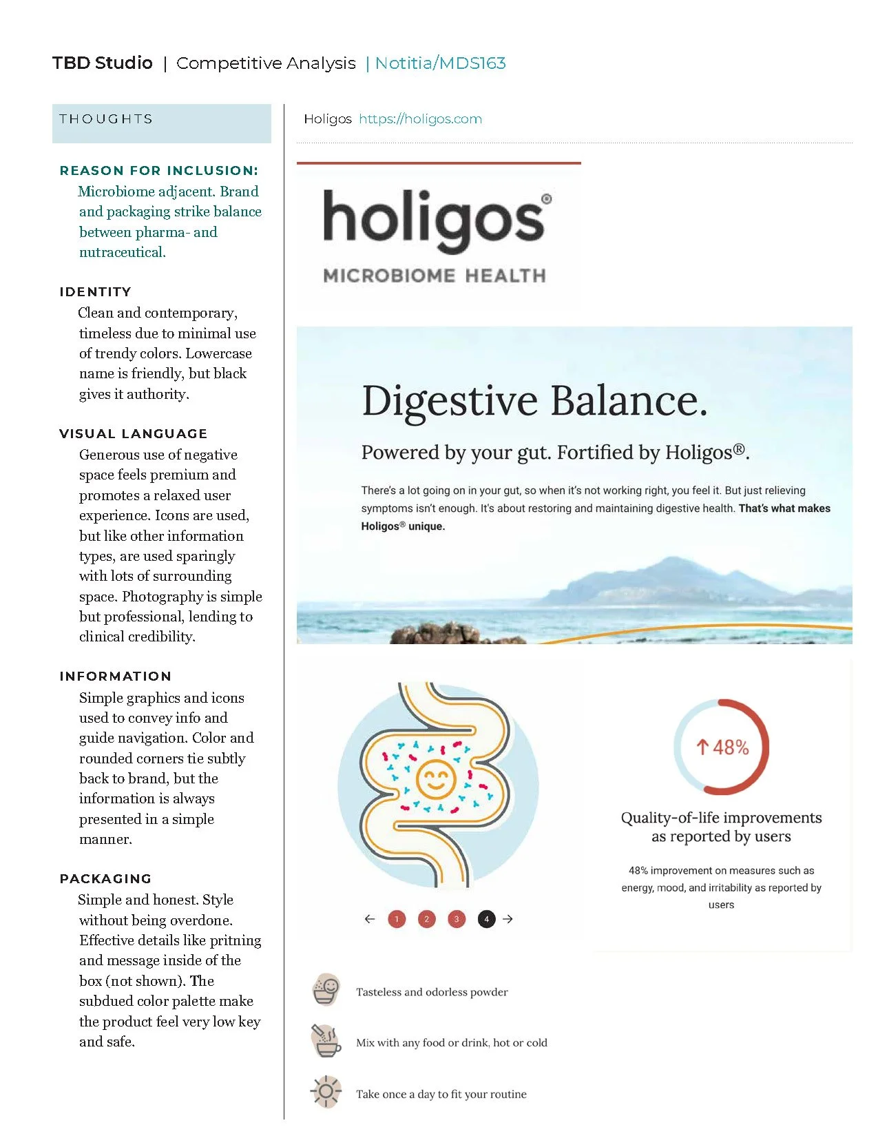
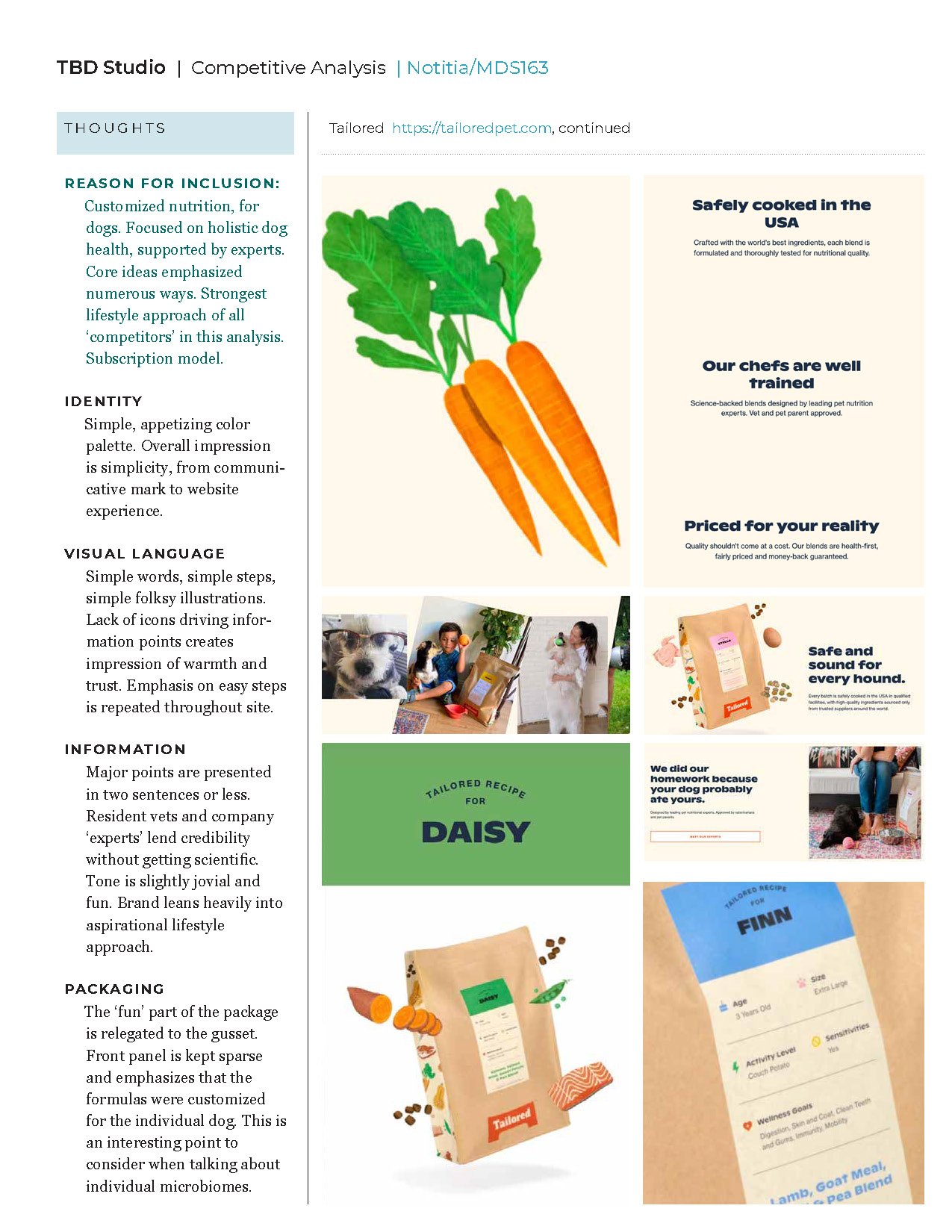
Client was in the startup phase of marketing a microbiome solution with unique research to set it apart from competitors. Before any creative work started, an analysis of major competitive and competitive-adjacent brands was undertaken. This was to help the client better understand their position in the space from a marketing perspective, as well as to get a feeling for where the client wanted to go visually so we could execute efficiently and the client felt like an informed part of the process. Once we understood how they wanted to be positioned, work began on simplifying their corporate mark, with an idea of friendliness and approachability in mind.